Open Object Palette
This operation opens the object palette. Use object palettes to define network objects, such as subnets, nodes, links, paths, and demands. To add a network object to your project, locate the object model in the palette and drag the model icon to the Project Editor workspace.
To open an object palette, do the following procedure.
Procedure 108: Opening an Object Palette
-
Choose Topology > Open Object Palette.
Or, click the Open Object Palette button.
Result: The Object Palette appears.
Note: When opening an object palette for the first time during a session, you may experience a short delay while your model directories are scanned for available models.
Note the following object palette characteristics:
-
Palette styles – There are two object palette styles:
- Tree View – Displays network objects in a hierarchical structure. For more information, see Understanding Object Palette Tree View.
- Icon View – Displays network objects grouped by defined sets. For more information, see Understanding Object Palette Icon View.
The default style of the object palette is defined by the “network_palette.style” preference.
-
Default scenario palette – Every project scenario has a default object palette that displays when the object palette is opened.
- In the Tree View, you can change the scenario’s default palette using a right-click menu option. The default palette is marked with a “D” on its icon and includes the “Default” label in its second column.
- In the Icon View, the scenario’s default palette is always the currently displayed palette.
-
Network’s Private Palette – Each project scenario can have a single scenario-specific palette, referred to as the “Network’s Private Palette”. The contents of the private palette can be different for each scenario in a project. You cannot view or configure the private palette of a different project or scenario.
- In the Tree View, the private palette is named “Network’s Private Palette”.
- In the Icon View, the private palette is named
<project_name>-<scenario_name>.
-
Shared Object Palettes – Palettes that are available to all project scenarios are called “shared object palettes”. The content of a shared object palette is the same for all projects. Additionally, if the palette is not read-only, the palette can be configured in any project or scenario.
Note: Wireless node models are available from the Object Palette if you have a Wireless license.
Switching between Object Palette Tree View and Icon View
You can switch between Object Palette Tree View and Icon View.
Procedure 109: Switching between Object Palette Tree View and Icon View
If switching from Object Palette Tree View to Icon View, do one of the following:
-
Click the Open Palette in Icon View button.
-
Right-click on a palette and select Open in Icon View.
Result: The Object Palette switches to Icon View.
If switching from Object Palette Icon View to Tree View
-
Click the Go To Palette Tree View button.
Result: The Object Palette switches to Tree View.
Understanding Object Palette Tree View
The Object Palette Tree View, shown in Figure 80, displays all available models in a hierarchical structure. At the top of the tree, models are organized in categories by type. At the bottom of the tree, models are organized in arbitrary collections, called palettes. The standard model library comes with predefined palettes. To serve your workflow, you can create custom palettes, as described in Procedure 110 Configuring Palettes in Object Palette Tree View. You can drag model entries into the network workspace to create network objects which have the attributes and behaviors of those models.
Figure 80: Object Palette Tree View
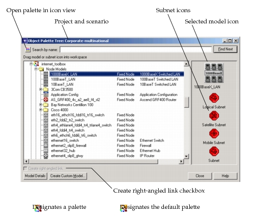
When a model is selected in the tree, the model icon appears at the top of the icon panel on the right side of the Object Palette Tree View. You can drag this icon into the network workspace to create a network object.
Subnet icons always appear below the selected model icon. You can drag these icons into the network workspace to create subnets. Subnets do not have model attributes. The subnet icon for fixed-position subnets is always available. If you have the Wireless module license, then mobile and satellite subnet icons are also available.
When a link is selected in the tree, the “Create right-angled link” checkbox is available for selection. Select the “Create right-angled link” checkbox to draw right-angled links. For more information, see Drawing Right-Angled Links.
The names of the project and the scenario are displayed in the Object Palette Tree View title bar.
Configuring Palettes
Use the Object Palette Tree View pop-up menu options to configure palettes, as described in Procedure 110. For a description of both the palette and model pop-up menus, see Table 50 and Table 51.
Procedure 110: Configuring Palettes in Object Palette Tree View
-
Make the palette the default palette. In this operation, the default palette acts as the target for the “Add” commands. The Network’s Private Palette is an alternative target. However, after you start configuring the Network’s Private Palette, it becomes the default palette.
1.1 Right-click on the palette and choose the option Make Default Palette.
*Result:* The palette becomes the default palette. The default palette is marked with a “D” on its icon and includes the “Default” label in its second column. -
Specify the models that you want included in the palette using the pop-up menus for palettes and models.
- To add all models from a different palette – Right-click on the other palette and choose the option Add All To Default Palette or Add All to Network’s Private Palette.
- To add a single model from a palette – Right-click on the model and choose the option Add to Default Palette or Add to Network’s Private Palette.
- To remove all models from a palette – Right-click on the palette and choose the option Clear This Palette.
- To remove a single model from a palette – Right-click on the model and choose the option Remove From Palette.
Table 50: Object Palette Icon: Pop-Up Menu Options
| Option | Description |
|---|---|
| Make Default Palette | Designates the palette as the default palette. The default palette is displayed when the object palette is opened. This option is disabled for the default palette itself. |
| Open In Icon View | Designates the palette as the default palette and switches to the icon view of the object palette. For more information, See Understanding Object Palette Icon View. |
| Configure In Icon View | Designates the palette as the default palette, switches to the icon view of the object palette, and opens the Configure Palette dialog box. For more information, see Configuring Palettes. |
| Add All To Network’s Private Palette | Adds all of the models listed in the palette to the Network’s Private Palette, and then makes the Network’s Private Palette the default palette. |
| Add All To Default Palette | Adds all of the models listed in the palette to the designated default palette. |
| Save Palette As… | Saves the palette with a new name to create a new palette. The new palette becomes the default palette. |
| Clear This Palette | Removes all models from the palette. This option is disabled for read-only palettes. |
| Remove This Palette | Deletes the palette. This option is disabled for read-only palettes. |
Table 51: Model Icon: Pop-Up Menu Options
| Option | Description |
|---|---|
| View Model Details | Opens the Model Description dialog box for the model. |
| Add To Network’s Private Palette | Adds the model to the network private palette and then makes the network private palette the default palette. |
Add To Default Palette:<default_palette_name> |
Adds the model to the default palette. |
Remove From Palette: <palette_name> |
Deletes the model from the palette. This menu item is disabled if the palette is read-only. Additionally, this menu item only appears for models in palette subtrees. This menu item does not appear for models in model type subtrees. |
Searching by Model Name
You can search for models by name in the Object Palette Tree.
Procedure 111: Searching by Model Name in Object Palette Tree View
-
In the Object Palette Tree, enter the search text in the “Search by name” field.
Tree items with names that exactly match or include the search text are considered matches. The search is not case-sensitive.
-
Click the Find Next button.
If an item is selected in the tree, the search starts from the selected item and searches down the tree. If no item is selected in the tree, the search starts from the top and searches down the tree.
Result: The next tree item meeting the search criteria is selected. The search proceeds into subtrees that are not currently open, except for subtrees that represent palettes. Unopened palettes are intentionally excluded from the search because they cannot contain models that are not listed elsewhere (especially within the “By Name” subtrees).
-
Click the Find Next button to find the next model.
Repeat this step as necessary. The search continues to cycle through the tree. When the search reaches the bottom of the tree, it continues searching from the top of the tree.
Viewing Model Details
From the Object Palette Tree View, you can view the details of a node or a link with just one click.
Procedure 112: Viewing Model Details in Object Palette Tree View
-
Select the model in the tree
-
Click the More Details button.
Result: The Model Description dialog box appears.
Creating a Custom Model
From the Object Palette Tree View, you can create a custom model by clicking the Create Custom Model button.
For more information, see Create Custom Device Model.
Understanding Object Palette Icon View
The Object Palette Icon View, shown in the following figure, displays network objects (including subnetworks, models, and links) as icons.
Figure 81: Object Palette Icon View
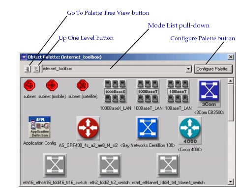
The Object Palette Icon View includes the following options for navigating and configuring the object palette:
- Go To Palette Tree View button – Switches the object palette to the tree view style. For more information, see Understanding Object Palette Tree View.
- Up One Level button – Returns to the group model. For more information, see Grouping Models in the Object Palette.
- Mode List pull-down menu – Displays the selected palette. For more information, see Using a Custom Model List.
- Configure Palette button - Configures the palette. For more information, see Configuring Palettes. By configuring the palette, you can limit the model icons displayed to those that match specified keywords (see Using Keywords) or those included in a custom model list (see Creating Custom Model Lists).
The header bar of an object palette identifies the keywords or custom model list used by that palette. When multiple keywords are used, only the first keyword is shown, followed by an ellipsis (…) to indicate that there are more keywords.
Configuring Palettes
An object palette can display all available models. However, you can configure the palette to display only a subset of the available models. For example, you can configure a palette to display only the Ethernet, ATM, and FDDI node and link models.
You can configure a palette for a particular project scenario, or you can configure a palette for general use in any project scenario.
There are two methods for specifying the models displayed in an object palette:
- Specify one or more keywords associated with the models.
- Specify a custom list of the desired models.
Both methods use the Configure Palette dialog box, which you open by clicking the Configure Palette… button. Note that when you use the Configure Palette dialog box, you are in edit mode and you cannot use the palette to create objects in the Project Editor workspace.
Figure 82: Object Palette with Configure Palette Dialog Box
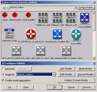
When you configure an object palette, the configuration applies to all other object palettes you open during the same Riverbed Modeler session. However, the configuration is not saved with the model.
To display sets of different models, you can open multiple object palettes.
Using Keywords
All node and link models supplied with Modeler have associated keywords. Keywords are the basis for selecting models for display in an object palette.
Note: The subnetwork object has no associated keyword and always appears in the object palette.
You can specify multiple keywords, in which case the object palette displays models that match any of the specified keywords. For example, if you specify the keywords “FDDI” and “link”, the object palette displays all models with the keyword “FDDI” and all models with the keyword “link”.
Some models are assigned the reserved keyword “hidden” and are not displayed unless you explicitly specify this keyword. These models are hidden because they are general in scope and often serve as parent models of supplied derived models (as described in “Derived Models” on page 125).
In addition to using the object palette, you can specify keywords from dialog boxes that include pop-up menus for model selection or via a preference when running Riverbed Modeler. If specified at run time, the keywords are used when you first open an object palette and thereafter until you change them. Run-time specification uses the “network_palette.style” preference.
Procedure 113: Specifying Keywords in Object Palette Icon View
-
Choose Topology > Open Object Palette.
Result: The Object Palette appears.
-
Switch to the Object Palette Icon View.
-
Click the Configure Palette… button.
Result: The Configure Palette dialog box opens.
-
Select the Keywords radio button, then click the Modify… button.
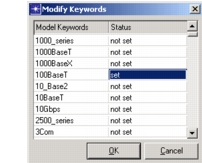
Result: The Modify Keywords dialog box appears.
-
Click in the Status column to toggle the status of each keyword as needed:
- Change the status of desired keywords to “set”.
- Change the status of undesired keywords to “not set”.
-
After setting the status for all keywords, click OK.
Result: The Modify Keywords dialog box closes and the object palette displays icons for only those models with the specified keywords.
Creating Custom Model Lists
A custom model list is a defined list of models that you want to display in an object palette. You can create as many custom model lists as you want. Each list is saved as a separate file.
To create a custom model list, do the following procedure.
Procedure 114: Creating a Custom Model List from Object Palette Icon View
-
Choose Topology > Open Object Palette.
-
Switch to Object Palette Icon View.
-
Click the Configure Palette… button.
Result: The Configure Palette dialog box opens.
-
Optionally, specify one or more keywords, as described in Procedure 113.
-
Click the Model List radio button.
Result: The buttons supporting custom model lists become active and the Modify… button becomes inactive.
-
Edit the object palette by adding or deleting models, as follows:
To add models (by name):
6.1 Click the Link Models or Node Models button.
*Result:* A Select Included Entries dialog box appears.6.2 Click in the Status column to set each model’s status to “included” or “not included”, as desired, then click OK.
*Result:* Each model with the status “included” is added to the object palette.To add models (by dragging):
6.1 Open an object palette that includes the model you want to add. 6.2 Click and drag the desired model’s icon into the object palette being edited.
To delete models individually:
6.1 Click the models to be deleted.
*Result:* Selection markers appear on the models.6.2 Click the Cut button.
*Result:* The selected models are removed from the object palette.To delete all models:
Click the Clear button.
Result: All models are removed from the object palette.
-
Click the Save As… button, enter a name for the custom model list when prompted, and click Save.
Result: The custom model list is saved to disk.
-
Click OK to close the Configure Palette dialog box.
Using a Custom Model List
After creating one or more custom model lists, you can specify which list you want to use for the current object palette. You can also specify a custom model list via a preference when running Riverbed Modeler. If specified at run time, the custom model list is used when you first open an object palette and thereafter until you change it. Run-time specification uses the “network_palette” preference.
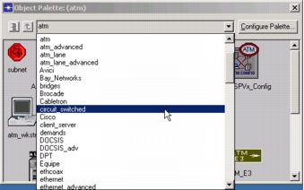
To specify a custom model list, select the desired list from the model list pull-down menu. Icons of the selected list appear in the palette and the list name appears in the dialog box header.
Figure 83: Model List Pull-Down Menu
Grouping Models in the Object Palette
You can configure the Object Palette Icon View to display icons for groups of related models. This can to make the palette less cluttered and easier to navigate, especially if the palette includes many models.
Not all models in the model library are grouped. In general, vendor-specific node models (such as Cisco or Bay Networks) are organized into groups while most other models are not.
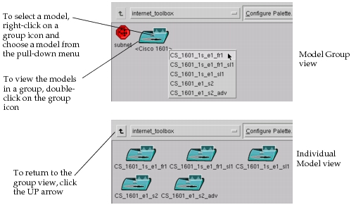
Figure 84: Grouping Models in the Object Palette
You can do the following in the object palette:
-
To view models by group, check the Enable Model Aggregation checkbox in the Configure Palette dialog box. The palette aggregates all models that have an associated group. Angled brackets in an icon label (for example,
<Cisco 1601>) indicate a model group.If Enable Model Aggregation is unchecked, the object palette displays all included models (one icon for each model) in one window.
-
To select a model from a group, right-click on a group icon and choose the model from the pop-up menu. You can also click on a group icon and place it in the network; a pop-up menu opens and lists the models in that group.
-
To view all models in a group, double-click on the group icon. The object palette “drills down” one level and displays all models in the group. To return to the previous level, click on the UP arrow in the upper-left corner of the palette.
A model’s group is determined by the “System Object ID” attribute in the model’s self-description. The object palette groups all included models with the same system object ID into one group.
Procedure 115: Viewing or Editing a Model’s System ID using Object Palette Icon View
-
In the Object Palette Icon View, right-click on the model. (You must right-click on an individual model icon – not a model group icon.)
Result: The Model Description dialog box appears.
-
Click the View Self-Description button to open the self description for that model.
-
Right-click on the core icon to open the “core Self-Description” dialog box. The System Object ID is listed in the Characteristics table of this dialog box.
Creating Nodes
Unlike subnetworks, nodes (and links) must have an associated model to describe how they behave in the network. These models are represented by icons in the object palette. When you drag a node model’s icon into the workspace (or select a link model’s icon to connect nodes), you create an instance (copy) of that model. The node (or link) is depicted in the workspace as an object and its “model” attribute is automatically set to the one chosen from the palette. In addition, the object’s attributes are updated to reflect the model specification, as described in “Network Reference” on page 60.
You can add node objects to the network model by dragging them from the object palette. For more information, see Open Object Palette.
For information about node labels, see Display of Node Labels.
Display of Node Labels
The label display for nodes (and subnets) can be set for optimum visibility and contrast. This feature is especially useful when placing nodes on a detailed background, such as a MIF map or a CADRG image.
The display of node labels is defined by the following options:
- “label color” object attribute – specifies the color of the label text. You can set the attribute for each node to contrast with the background. The default color is black.
- “network_visualization.node_label_style” – Specifies the node label background.
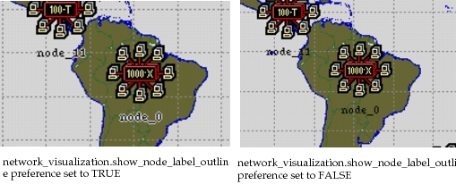
- “network_visualization.show_node_label_outline” preference – specifies whether to display a shadow behind the label text for nodes (and subnets). Valid values are TRUE and FALSE. The default is TRUE. The following figure shows the visibility and contrast of node labels with and without shadows.
Figure 85: Node Labels (With and Without Shadows)
Display of Peripheral Nodes in Subnets
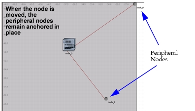
When a link is connected to a node outside of the current subnet, the peripheral node is represented by a peripheral node icon. (By default, peripheral nodes are represented by small gray icons.) The placement of the peripheral node identifies the location of the node.
The following figure shows the display of peripheral nodes as small gray icons.
Figure 86: Example of Peripheral Nodes
You can perform the following actions on peripheral nodes:
-
Peripheral nodes can be repositioned
You can move peripheral nodes anywhere within the subnet. Peripheral node placement is maintained for each subnet. Therefore, when you enter a subnet, the peripheral nodes are located where you last placed them.
Set the following preferences to define peripheral node placement:
- “network_visualization.peripheral_node_location” – Specifies the default placement of peripheral nodes.
-
Paths of links connected to a peripheral node can be redefined
You can redefine the paths of peripheral node links (right-click on the link and select Redefine Path).
-
Customize peripheral node label to display either the base name or the full hierarchical name
To make labels easy to read, you can define the content and style of peripheral node labels using the following preferences:
- “network_visualization.peripheral_node_hide_title” – Specifies whether to hide peripheral node names.
- “network_visualization.peripheral_node_label” – Specifies whether to use hierarchical name for peripheral node labels. Hierarchical names include all the parent subnet names prepended to the node name.
- “network_visualization.node_label_style” – Specifies the background color of the node label.
-
Define icon used for peripheral nodes
By default, peripheral nodes are represented by a small gray icon. You can define the icon and it maximum size with the following preferences:
- “network_visualization.peripheral_node_icon” – Specifies the icon used to represent peripheral nodes.
- “network_visualization.peripheral_node_max_icon_size” – Specifies the maximum size of peripheral nodes, in pixels.
-
Collapse peripheral nodes to display common parent subnet
By default, peripheral nodes are grouped by common parent subnet, excluding the parent subnet. Grouping the peripheral nodes by subnet cuts down on visual clutter and allows you to more easily determine the actual location of peripheral nodes. You can change whether to collapse peripheral nodes with the following preference:
- “network_visualization.collapse_peripheral_nodes” – Specifies whether to collapse all peripheral nodes to their highest common ancestor which is not the parent of the current subnet.
Note: You can save peripheral node locations and link bend-points in a model assistant (.MA) file. Later, you can import the .MA file to reproduce the layout.
Creating Links
Links define communication channels between nodes. To create a link, select a link model from the object palette and then click on the nodes you want to connect.
For more information about creating links, see:
- Drawing Right-Angled Links
- Redrawing Links
- Bundling Links and Demands
- Link Label Placement and Rotation
Drawing Right-Angled Links
Drawing right-angled links allows you to create topologies that are easier to understand and more aesthetically pleasing. Drawing right-angled links does not affect analysis results.
To draw right-angled links, select the “Create right-angled link” checkbox before selecting a simplex or duplex link model from the object palette tree view. (For more information, see Understanding Object Palette Tree View.) You can then draw the link from one object to another object. Note the following characteristics when drawing right-angled links:
- Drawing a right-angled link between two objects that are horizontally or vertically aligned creates a single link segment from one object to another object.
- Drawing a right-angled link between two link objects that are not horizontally or vertically aligned creates two perpendicular link segments from one object to another object.
To create additional link segments, click the workspace. Creating additional link segments is useful when drawing a link around an existing network object to avoid overlap and clutter.
The default setting of the “Create right-angled link” checkbox is specified by the “draw_right_angled_links” preference.
The advanced attributes of a link (right-click on a link and select Edit Attribute (Advanced)) includes the new attribute “right-angled”. With this attribute, you can enable or disable the right-angled characteristic of a link. Changing the attribute automatically changes display of the link. The right-angled characteristic is retained when network objects are moved.
Redrawing Links
You can redraw a link to make the network topology easier to understand and more aesthetically pleasing. Drawing links around network objects does not affect analysis results.
Procedure 116: Redrawing a Link
-
Do one of the following:
- Right-click on the link that you want to redraw and choose Redefine Path.
- From the Advanced Attribute dialog box (right-click on the link and choose Edit Attributes (Advanced)), select the Redefine Path button.
Result: The selected link is deleted and the link model is automatically loaded and ready for you to redraw.
-
Redraw the link.
When drawing the link, click the workspace to create an additional link segment. Creating additional link segments is useful when drawing a link around an existing network object to avoid overlap and clutter.
The link is redrawn using the current setting of the “right-angled” attribute. For more information about the right-angled attribute, see Drawing Right-Angled Links.
For more information about drawing links, see Creating Links.
Bundling Links and Demands
Similar links (or demands) between two nodes can be bundled, which displays the links as a single object. Bundling is based on link display attributes (i.e., head and tail color, link thickness, and line style).
You can expand a link bundle to display the individual links. When a link bundle is expanded, you can view the individual links of a bundle in a way that is easy-to-read with minimal clutter.
The link bundling feature is activated using the “network_visualization.auto_link_bundling” preference. Additionally, if activated, this preference specifies the default display of bundled links: collapsed or expanded (fanned-out). The following figure shows the link bundling feature’s affect on link display.
Figure 87: Typical Link Display: Non-Bundled and Bundled
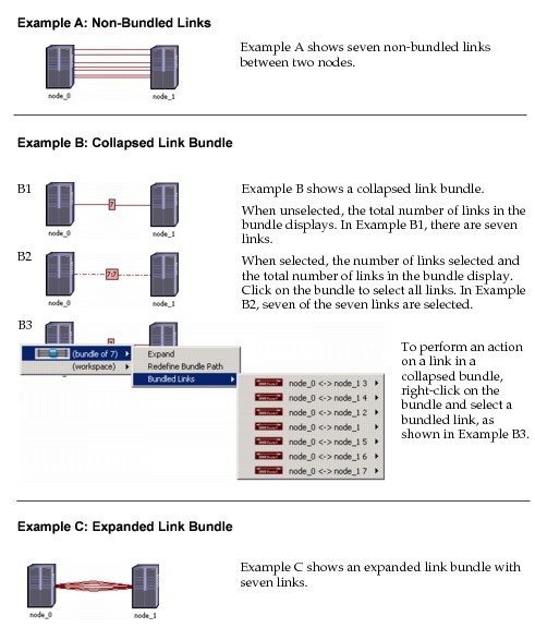
In addition to the “network_visualization.auto_link_bundling” preference, which sets the link bundling feature globally, each link includes the attribute “bundle display”, which sets the link bundling option individually. When the link bundling preference is activated, set the “bundle display” attribute to override the preference.
The “bundle display” attribute settings are
- include in bundle and display fanned out – Specifies to include the link in a bundle. Additionally, by default, display the link in an expanded bundle.
- include in bundle and display collapsed – Specified to include the link in a bundle. Additionally, by default, display the link in a collapsed bundle.
- exclude from bundle – Specifies to exclude the link from any bundle.
The link bundle display is specified using pop-up menu operations. The following table lists the operations associated with link bundling. For a complete list of object operations, see “Object Pop-Up Menu” on page 116.
Table 52: Link Bundling Operations: Collapsed and Expanded
| Option | Description |
|---|---|
| Collapsed Link Bundle (Right-click on link bundle object) | |
| Expand | Expands the collapsed bundle to display the individual links in the bundle. |
| Redefine Bundle Path | Allows you to redefine a bundle path by drawing it in the workspace. When this operation is selected, the link bundle is deleted and the link model is automatically loaded so that you can redraw the link bundle. |
| Bundled Links | Allows you to perform an action on a link in the link bundle. |
| Additional Options – Single-click on a link bundle to select all links in the bundle. – Double-click on a link bundle to expand the bundle. Note: A collapsed link bundle is not a network object on which you can perform operations. Instead, the collapsed link bundle represents the bundled links. |
|
| Expanded Link Bundle (Right-click on a link in a link bundle) | |
| Collapse to Bundle | Collapses similar links into a bundle. |
Note: If a link in a bundle is drawn with multiple segments, then the collapsed bundle path follows the multi-segment link. If two or more links in a bundle are drawn with multiple segments, then the collapsed bundle path follows one of the multi-segment links.
Link Label Placement and Rotation
The display of link labels is designed to produce a network topology that is easy to read and aesthetically pleasing. The design includes the following:
-
Link Label Placement – By default, link labels are placed horizontally next to the longest segment of a link. If the two longest link segments are of the same length, then the link label is placed next to the horizontal link.
Note: The option to display link labels is defined by the “network_visualization.show_link_labels” preference.
-
Link Label Rotation – By default, link labels are displayed horizontally. However, you can rotate the label using the link attribute “label rotation”. The “label rotation” attribute can be set to horizontal, vertical, parallel to link, or perpendicular to link. The following procedure describes setting link label rotation for one or more links.
For more information about attributes, see “Edit Attributes” on page 361 and “Network Reference” on page 60.
Procedure 117: Setting Link Label Rotation for One or More Links
-
Select the link(s) for which you want to define label rotation.
-
Right-click on a selected link and choose Edit Attributes (Advanced).
Result: The Edit Attributes dialog box appears.
-
Select a value for the “label rotation” attribute: horizontal, vertical, parallel to link, or perpendicular to link
-
If defining label rotation for multiple links, click the “Apply changes to selected objects” checkbox.
-
Choose OK.
-
The Edit Attributes dialog box closes and the label rotation is applied to the selected links.