Creating a New Dialog Box
Follow these general procedures to create a new dialog box.
Procedure 13: Opening the Editor and Naming the Dialog Box
-
Run NetPlanner with the OPNET Development Kit.
-
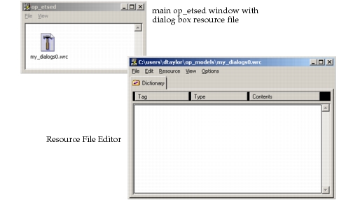
Start the Dialog Box Resource File Editor (op_etsed) by choosing File > New > Dialog Box Resource File. You can create multiple independent instances of this editor.
-
Enter a name for the resource file you will create.
A resource file consists of a top-level dictionary, which is a folder for dialog boxes and other visual elements. Dictionaries allow you to organize related components as groups. You can also create sub-dictionaries to further organize components within a single file.
Result: The Dialog Box Resource File Editor opens and displays both the main op_etsed window and the Resource File Editor.
-
Create a new dialog box object in the Resource File Editor. In the Resource File Editor, choose Resource > New > Dialog.
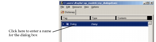
Result: A new dialog box object is created, and appears in the Dictionary page.
Note: The ETS API can only access dialog boxes of type Dialog. Be sure that the object you insert is a “Dialog” object.
-
Name the dialog box. Click in the Tag column for the dialog box object, then enter a tag name. This step is important because the ETS API uses this tag to reference a specific dialog box. Dialog boxes located in nested dictionaries are referenced as
<level_1_dict_name>/<level_2_dict_name>/.../<dialog_tag>.
You will define basic information about the dialog box in two editors: the Dialog Box Editor and the Container Editor.
Figure 16: Dialog Box Editor and Container Editor
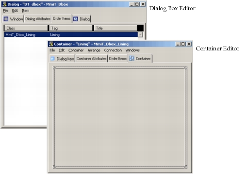
Note: When you open an ETS dialog for editing, the Container Editor is automatically opened as well. However, when you close the Container Editor, the Dialog Box Editor is not automatically closed.
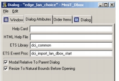
The Dialog Box Editor allows you to view and specify general information about a dialog box. Each tabbed page allows you to enter different types of information:
- Window—Set general information about the dialog box and window, such as tag, title, and size
- Dialog Attributes—Specify support files, such as help files and ETS callback procedures (handlers)
- Order Items—Display all top-level controls in a list view
- Dialog—Display the visual layout of the dialog box
Figure 17: Tabbed Pages in the Dialog Box Editor
Procedure 14: Opening the Dialog Box Editor and Container Editor
-
In the Resource File Editor, double-click on either the icon in the Tag column or in the Type column.
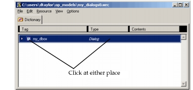
Result: The Dialog Box Editor and the Container Editor both open.
-
Specify an ETS library and default event handler, as follows.
2.1 If the Dialog Attributes page is not visible, click the Dialog Attributes tab.
*Result:* The Dialog Attributes page moves to the front.2.2 Specify the file name in the ETS Library field. Do not include the suffix; for example, if your library has a file name of
my_library.gui32.i0.ets.dll(ormy_library.gui32.i1.ets.so), enter onlymy_library. 2.3 Specify a default event handler function in the ETS Event Proc field. 2.4 If the dialog box will have a help button, enter the help file name in the HTML Help File field.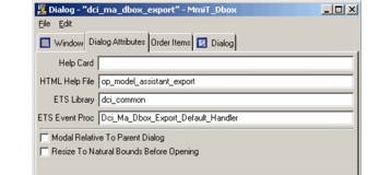
-
Specify a tag and title.
3.1 Click on the Window tab.
*Result:* The Window page appears.3.2 Enter strings in the Tag and Title fields.
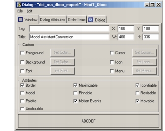
Next, define general information about a dialog box in the Container Editor.
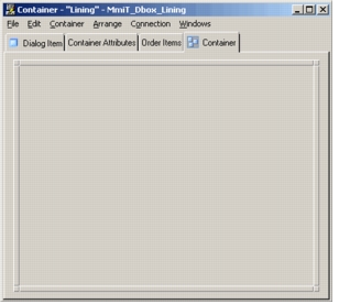
Inside each dialog is a special container control called the lining. All ETS controls must reside inside the lining. The menu bars, tool bars, and status bars of Riverbed editor dialog boxes are outside the lining, but these are not currently supported by ETS. When you first create a dialog box, it has a single container. You can add other containers inside the lining to further organize the active controls.
The lining itself should not be deleted, renamed, or otherwise reconfigured (the spring connections of the lining itself should be: zero-length, locked fixed struts on all four sides and full springs along the width and height). Properties (such as Resizable) should be set on the dialog box and not on the lining.
The Container Editor allows you to view and specify general information about a dialog box container. Each tabbed page allows you to enter different types of information:
- Dialog Item—Set general information about the dialog box container, such as tag, title, and size
- Container Attributes—Add scroll bars and other dialog box-wide attributes
- Order Items—Display all top-level controls in a list view
- Container—Edit the layout of the dialog box
Figure 18: Tabbed Pages in the Container Editor
Procedure 15: Editing a Container
-
Make the Container Editor the active window.
-
If the Container page is not visible, click the Container tab.
Note: The Container Editor looks similar to the Dialog Box Editor, but controls must be added here, in the top-level container, for ETS to see them.
-
Insert UI controls. You can do this in either of two ways. The item palette method is recommended because controls added this way have reasonable default values and internal spring connections. If you add controls via the menu, you will have to set these parameters manually.
Add a control via the item palette.
3.1 Choose Windows > Item Palette to open the palette. 3.2 Use the same drag-and-drop method you use with the object palette when building a network model. 3.3 Customize the palette by adding or removing controls. To add a control to the palette, choose File > New Item (from the Item Palette menu bar), then choose the control type from the submenu. To remove a control, select it and choose Edit > Clear.
Add a control via the menu.
3.1 Choose Container > New Item >
<control type>. -
Assign an event handler to each active control, using the unique editor for that control. You do not need to assign event handlers for labels, line items, box items, or icons.
4.1 Open the
<control_type>Editor by double-clicking on the control in the Container Editor.*Result:* The `<control_type>` Editor opens. **Figure 19: Sample `<control_type>` Editor (Checkbox)** 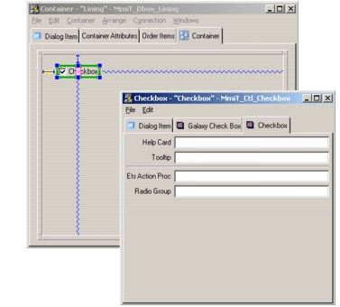4.2 Click on the
<control_type>tab. 4.3 Enter the event handler function in the ETS Action Proc field. This function must be defined in the ETS library you assigned to the dialog box. -
Assign a tag to the control. This step is important because the ETS APIs use tags to access specific user-interface (UI) controls and the underlying data. To assign a tag:
5.1 Click on the Dialog Item tab.
*Result:* The Dialog Item page appears. 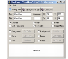5.2 Enter a string in the Tag field. Each control in a dialog box should have a unique tag if you wish to access that control through ETS.
You might also want to specify other settings appropriate to the type of control you have created. If you have created a button, for example, you will want to specify a title. The title (such as “OK” or “Cancel”) appears on the button and indicates its function to the user. After you have specified the settings, close the Dialog Item Editor and return to the Container Editor. -
Place and arrange your UI controls in the Container Editor. Each UI control has a set of connections that size the control and locate it within the container. See Arranging Controls in a Dialog Box for a detailed description of this topic.
-
Test the layout of your dialog box.
7.1 In the Dialog Box Editor, click the Dialog tab
*Result:* The Dialog page appears.7.2 Choose Dialog > Try Dialog to see what the “live” dialog box looks like.
-
Save your dialog box and quit op_etsed.
-
Create and compile a ETS library. This is an ETS object file (
.ets.dllor.ets.so) containing event handlers for your dialog box. You can define only one library per dialog box. For this reason, you must include all event handlers for a dialog box in a single library. See “Creating Dialog Boxes“ on page 245 for more information on creating event handlers for dialog boxes.