Creating Dialog Boxes
You can create the following types of controls in a dialog box:
- Buttons
- Checkboxes
- Fields (user can enter textual data)
- Labels (static text strings not modified by user)
- Pop-up menus
- Radio buttons
- Treeviews
- Icons
Examples of these controls appear in Figure 2.
Figure 2: Dialog Box Controls
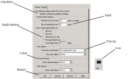
Table 9 lists each of the control attributes.
Table 9: Control Attributes
| Attribute | Description |
|---|---|
type |
Available values are button, checkbox, pop-up, field, label, radio, icon. |
id |
A unique character string used to identify the control in the source code you write. This attribute can have the same value as the label attribute (Enable, Cancel), or a similar value (OK1, OK2). |
left |
Placement of the left side of the control, measured in pixels from the top left corner of the dialog box. |
top |
Placement of the top side of the control, measured in pixels from the top left corner of the dialog box. |
width |
Width of the control, measured in pixels. |
height |
Height of the control, measured in pixels. |
label |
A text string that identifies the control to the user (Enable, Cancel). Required for checkboxes. |
options |
Varies, depending on the control type. Labels: • none (no options specified) Pop-ups, Buttons, checkboxes, Radio buttons: • none (no options specified) • default (the button is the default button in the dialog box) • disabled (the button is drawn disabled when initially displayed) Fields: • disabled (the field is drawn disabled when initially displayed) • hbar (the field contains a horizontal scroll bar) • vbar (the field contains a vertical scroll bar) Icons: • border (the icon has a 3-D border that gives it the appearance of a button) |
event_handler |
Pop-ups, Buttons, Checkboxes, Radio buttons, Icons. If you specify this optional control-specific event handler, it is called when the control is clicked. This event handler and the high-level event handler follow the same prototype, as given in "Handler Prototypes" on page 37. |
entries |
Pop-up menus only. Defines the list of available items. Enter items in a comma-separated list. If any string contains a space, place the entire list in double quotes. |
selection |
Pop-up menus only. Defines the default selected item when the menu is created. |
group |
Radio buttons only. Group the radio button belongs to. All buttons in the same group are mutually exclusive. This means that only one member of the group can be selected at a time. Enter a unique string. |
state |
Checkboxes, Fields Checkboxes can have a state of disabled or enabled.Required for checkboxes. Specifies the values in a field. Enter a string, or, if a multi-line field, a comma-separated list of strings. Commas signal the ends of lines. The number of strings entered should match the value of the line_count attribute. |
line_count |
Fields only. Specifies the maximum number of text lines the field can hold. |
icon_name |
Icons only. Name of the icon in the icon database. |